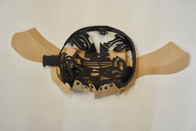
I spent friday, putting the final touches to the planned image. This meant re-creating paper cut image of a ship in a bottle into a partially 3D model. I say partially as it is more of a 3D paper cut than a 3D model. I cut out the main shape and ship as it had been before, then to give the illusion of it being 3D I added some details that are slotted into the papercut. I have bent the paper so that it gives a rounded effect to the bottle.
I think the model is effective, however, I feel that my paper cutting technique could do with being neater as it still appears fairly naive and rushed.
This image shows what the ship in a bottle looked like within the context of the image. By then, I had also made paper hands. The hands were mainly flat paper cuts that had been folded. Although, I had added some relief to represent the muscle/bone structure of the thumb. This doubled up as a platform to hold up the bottle paper cut. I realised that the from a distance, it wasn't obvious that there are hands holding the bottle. Therefore i made some forearms, as seen in the photo below. These are partially relief, to avoid the arms looking too flat compared to the hands and bottle.
Photographing the Image:
As the image is 3D and on a large scale, i can only photograph it, to then transfer to my mac. I have set up a makeshift photoshoot in my bedroom. Using desk lamps and white paper. Composing the image does feel like creating a theatrical set or a stop frame animation. I really enjoy this process, putting together individual pieces to compose a full image.
Lighting is an important element to the image as it can determine an atmosphere or representation of the image. I experimented with a variation of lighting positions trying to decide what works and what doesn't.
1. Light has been placed on the mid-right. The lighting on the face is really effective, however, the positioning of the bottle, as little lighting on it, has resulted in the the viewer not being able to see the ship in the bottle.
2. The Light has a low position at the bottom of the image. This has created a very dark mood and concentrates more on the ship in the bottle, which works much better. It also more in keeping with the advice given by Rhyannan. The shadows are also interesting in this one.
3. There are two lights on this composition. One positioned at the right hand side and the other at the bottom of the image. I prefer this the most out the images, for the bottle and the character together. The light coming from the side looks as if it could be coming from a window. Perhaps, i could experiment with using a window pane stencil to see if that is effective?
4. I also like the lighting on the face here, however the ship in a bottle is way too dark. In fact, it's barely visible. Anyhow, the edges are intriguing, they have that silhouette framing effect.
Adding colour:
I noticed that the detailing on the bottle and the collar of the dress, were clashing. I needed a solution to direct the viewer's attention to the bottle as a main focus. There still a lack of colour in my images, so it seemed inevitable to add some here.
The above image is an example of adding colour through the magic wand tool on photoshop. I am still able to retain the shadows created in my photoshop. It also defines the dress well, as before the viewer may have wondered whether it was clothing or not. I still think attention is drawn away from the ship in the bottle.
The following images are examples of the bottle in the hands standing along. This cuts down what the audience has to see. Its straight to the point. I could imagine this being effective for the poster, with the typography underneath or above.


No comments:
Post a Comment