Since progress is going well with my paper cutting work, I decided to collaborate the methods of paper cutting and paper sculpting together. Instead of making the anchor/chandelier completely 3D, I decided to build it as if it were coming out of a page (i.e. half 3D, half flat paper cut). This was with the intent of photographing the object lying on top of paper.
For the paper cut design, i looked much more at the previous research I had done into regency era interiors, taking inspiration from embellishment and wallpaper designs. The main reason I have decided to go back to this previous idea as I think its a powerful symbol that brings together the regency era setting and naval references in
Persuasion.
Progress shot of anchorlier: This is after the day 1 of two days of making.
Despite the scale of the anchor to the background, I was happy with how it looked. I think my concerns are definitely with my photography skills. The space in which the objects are photographed needs to be more considered.
Anchorlier photographed flat- This does not work due to the glare and generally looks really unprofessional. Also i'm not convinced the colours go together. The black needs to be against a neutral colour or have something going on behind.
Photographing the anchor hanging vertically with a brown background.
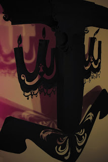
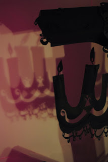
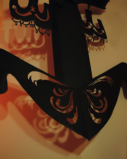
The photoshoot of the anchor wasn't as successful as anticipated. When placed on the paper, the object seemed to get lost and became very flat as an image. I needed to find a way to make the object more lifelike and performative. In response to this issue, I decided to hang the anchor vertically in front of a background. I used several pieces of A2 white card as a background and set up two lamps to light the object. I also had access to colour gels that I had purchased in the past week. The cross-over of the light created two overlapping coloured shadows. The pink/purple shadows worked the best, as i feel it evokes a warm atmosphere and generally had the strongest shadow. The compositions, however, are very weak as there crop out a lot of object making it hard for the viewer to make out what the image is of. I'd like to re-shoot this object and the future objects I make in a larger space to get a better photo shot. This will save me a lot of time using the clone stamp tool in photoshop to correct the sloppy photography.


No comments:
Post a Comment