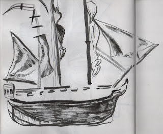
I have been experimenting with a range of ideas to develop into 3D form, here are some images taken from my sketchbook.
Poster design concepts, including hourglass designs. I had the idea to use the hourglass as a metaphor for the protagonist's time running out. (It was also used on ships as way for the navy telling the time whilst onboard). However, after some consideration, it seems far too far fetched and over-complicated for a poster design.
Compared to the previous ideas, this is much simpler. I like the idea of incorporating rope.
Out of these drawings, I much prefer the simpler naval references such as the anchor and the rope. My attempts to draw a whole ship don't work, mostly as they aren't detailed enough and wouldn't translate well into 3D form.
Therefore, it has been decided that I should focus more on simple imagery- such as an anchor ect. These will still be recognisable as 'naval' to the viewer.
These abstract drawings of ships have given me much more scope for development. Looking back on them, I can see how despite their lack of detail, a viewer would be able to distinguish the image as a ship due to the shapes and composition used. In effect they suit a design much better, rather than me trying to be overly clever with the image content.


No comments:
Post a Comment