The first of the experiments was an anchor/chandelier. I wanted to find a way to combine the naval themes of persuasion with the regency era and upper classes, that are so regularly chastised by the author. I have applied line very simply, looking at shapes ect. The candles on the 'chanchor'/''anchlier' are shaped as sails. Again I feel like i'm trying to squeeze too many ideas into one image.
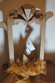
The next experiment was making a set in which to put objects that I had made in. I used images I had drawn of mirrors earlier in the project as inspiration. The idea was to have the 'reflection on oneself' as a focal point of the image.
Above: The creation of shadows in this image really creates an atmosphere. I need to consider more where cut out artwork should be applied to make the shadows more interesting to look at.
Here I have tried adding objects into the frame. I liked the idea of having a face within the sails, to give more context. Possibly giving hints to her love being aboard the ship. Unfortunately, I don't think this idea worked as well as i intended, as when hung up in the frame, I found it hard to difficult to secure the sails in one place to be photographed clearly.
I presented these images in my group tutorial, the main feedback was that the exposed cardboard didn't coincide so well with the regent era my text is set in. It was suggested that I should use back mount board instead. I agree that cardboard doesn't really work in a final image, black has been much more effective in my other 3D work. However, working in black means not being able to project any images or colours onto the work, something I was interested in looking into. Maybe doing some models in black and some in white may be an interesting.


No comments:
Post a Comment