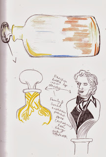
I wouldn't say this was the best day of development, but it was interesting to see how how themes could be incorporated into the 'ship in the bottle' idea. I particularly like the idea of the bottle being shapes like a building in Bath or the cork being in the shape of a dandy/satirical upper class character. This would put the bottle idea into more context of other parts of the text as well as setting the scene of the play. I also like I've started to document colour into my drawings, therefore I can get a sense of how it could be used later on.
On a secondary note, I'd like to explore drawing textures more that could be applied to the poster, perhaps using programs such as Photoshop and Illustrator.


No comments:
Post a Comment