Thursday, 31 October 2013
Further research into paper art/set design
The tree inventors from Ethane Tivano on Vimeo.
During my tutorial, it was suggested that I look at the above video. The way in which characters interact with the set is really well done, I particularly like the limited colour palette, it accentuates the details of the paper cuts and makes the end, where the set is set on fire even more effective.
Also it has made me reflective on where my practice could go. It is obvious that if illustrators want to get into set design, they must be open to creating moving illustrations.
Creating sculpture out of cardboard
Inspired by the life drawing workshop, I wanted to experiment with building my sets of cardboard. This mainly to explore structure and how it would look cut into.
The first of the experiments was an anchor/chandelier. I wanted to find a way to combine the naval themes of persuasion with the regency era and upper classes, that are so regularly chastised by the author. I have applied line very simply, looking at shapes ect. The candles on the 'chanchor'/''anchlier' are shaped as sails. Again I feel like i'm trying to squeeze too many ideas into one image.
The first of the experiments was an anchor/chandelier. I wanted to find a way to combine the naval themes of persuasion with the regency era and upper classes, that are so regularly chastised by the author. I have applied line very simply, looking at shapes ect. The candles on the 'chanchor'/''anchlier' are shaped as sails. Again I feel like i'm trying to squeeze too many ideas into one image.
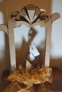
The next experiment was making a set in which to put objects that I had made in. I used images I had drawn of mirrors earlier in the project as inspiration. The idea was to have the 'reflection on oneself' as a focal point of the image.
Above: The creation of shadows in this image really creates an atmosphere. I need to consider more where cut out artwork should be applied to make the shadows more interesting to look at.
Here I have tried adding objects into the frame. I liked the idea of having a face within the sails, to give more context. Possibly giving hints to her love being aboard the ship. Unfortunately, I don't think this idea worked as well as i intended, as when hung up in the frame, I found it hard to difficult to secure the sails in one place to be photographed clearly.
I presented these images in my group tutorial, the main feedback was that the exposed cardboard didn't coincide so well with the regent era my text is set in. It was suggested that I should use back mount board instead. I agree that cardboard doesn't really work in a final image, black has been much more effective in my other 3D work. However, working in black means not being able to project any images or colours onto the work, something I was interested in looking into. Maybe doing some models in black and some in white may be an interesting.
Saturday, 26 October 2013
Life Drawing session 25.10.13: 3D Form
I found this life drawing session very beneficial to this current project as it allowed me to very abstract and creative with my drawing as well as making me think of 3D form and composition. I was generally very happy with the outcomes of this day, in particular I really like the cut out drawings. The shapes that make up the body of the model at times were very angular and devoid of human shape, yet they are still recognisable as a human form. It made me consider whether the objects I have been making could make up one image of a character in the theatre production.
Thursday, 24 October 2013
Experimenting with paper
At the beginning of the week, I started working into paper, to see the effectiveness of my ideas in 3D form. My first attempt as an idea to have a series of different scenes, all in the shape of an hour glass. After the first image (see below) I observed that it didn't really work in terms of composition. I was trying to fit too much into each scene, which wouldn't work once the scenes were placed together in a photoshoot. Following this test, I went back to drawing ideas.
The following experimentations with paper were inspired by one of my initial ideas to have an image of a ship in a bottle. The first of the models incorporates both 2D and 3D illustration. I liked the idea of the ship being a prominent element of the composition, making an 'escape' from the confinement of the bottle. The image was inspired by abstract observational drawing of ships. I experimented with different shapes to make the sails and even cut back into one of the sails to replicate a regency era clock. Put together, I don't think the differing shapes work well together in a composition. There is no vocal element to the image to make it clear what the shapes create. Perhaps I should have added a 3D shape at the bottom to suggest a body of a ship.
The following experimentations with paper were inspired by one of my initial ideas to have an image of a ship in a bottle. The first of the models incorporates both 2D and 3D illustration. I liked the idea of the ship being a prominent element of the composition, making an 'escape' from the confinement of the bottle. The image was inspired by abstract observational drawing of ships. I experimented with different shapes to make the sails and even cut back into one of the sails to replicate a regency era clock. Put together, I don't think the differing shapes work well together in a composition. There is no vocal element to the image to make it clear what the shapes create. Perhaps I should have added a 3D shape at the bottom to suggest a body of a ship.
The images above and below show my attempts at paper folding and cutting to illustrate waves. I used a mix of gel like plastic and black paper to create these samples. The most successful out of these were the strips of material that had been cut into and twisted. This was because they had more of an organic shape and gave more movement. The coiled sample reminded me more of cable, or perhaps rope and the flat sample lacked movement and looked a little flat alongside the other 3D models.
This illustration was another idea to have Bath architecture as part of the structure of the bottle, this was mainly to give more inkling to the setting of the play. As you can see from the photograph, the lack of the light into the paper sculpture, means the viewer is unable to see the full details of the windows. If I were to develop this idea, i'd need to cut back into the paper.
A paper sculpture of an hourglass. Although, very simple, I like how the amount of space within the structure of the model has made an eery shadow when photographed.
The above set of photos, show a sculpture in progress. This is a female head, in which i intend to add to composition, either with a mirror or alongside ship imagery. I have used previous techniques I used when mask making in my second year, constructing a base shape out of one piece of card. I have experimented with the suggestion of hair by cutting strips of card and weaving them in and out of the base to illustrate a regency style bun hairstyle. Although not finished, I am liking the effect this technique has created.
Below are some experimenting with cutting into flat paper and forming sculpture from those cuts. I have concentrated on naval objects, an hourglass and a ship steering wheel. I liked the mixture of cut out pattern and sculpture and how they both create interesting shadows when photographed.
Wednesday, 23 October 2013
Focus on naval imagery for poster design
In my chosen text, there is a lot of reference to the navy. This has been used by the author to accentuate snobbery within the upper class. I have been collecting images to inspire my drawing:
I have been experimenting with a range of ideas to develop into 3D form, here are some images taken from my sketchbook.
Poster design concepts, including hourglass designs. I had the idea to use the hourglass as a metaphor for the protagonist's time running out. (It was also used on ships as way for the navy telling the time whilst onboard). However, after some consideration, it seems far too far fetched and over-complicated for a poster design.
Compared to the previous ideas, this is much simpler. I like the idea of incorporating rope.
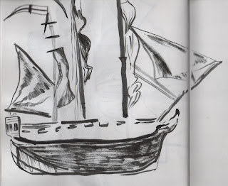
Out of these drawings, I much prefer the simpler naval references such as the anchor and the rope. My attempts to draw a whole ship don't work, mostly as they aren't detailed enough and wouldn't translate well into 3D form.
Therefore, it has been decided that I should focus more on simple imagery- such as an anchor ect. These will still be recognisable as 'naval' to the viewer.
These abstract drawings of ships have given me much more scope for development. Looking back on them, I can see how despite their lack of detail, a viewer would be able to distinguish the image as a ship due to the shapes and composition used. In effect they suit a design much better, rather than me trying to be overly clever with the image content.
Tuesday, 15 October 2013
Further research into an illustrator's accessibility to set design...
There are examples such as Lion King The Musical, that involves what looks like either a backdrop with or projections of naive illustrations. However, these were probably drawn by the set designer, Richard Hudson, himself rather than employing an illustrator.
Set Designs by Artists....
David Hockney- Die Frau Ohne Schatten (1992/93)
Examples of Pablo Picasso's set designs.
Evidently, neither Hockney nor Picasso, started off from a theatre design education, yet their interpretation of text can be applied to a Theatre context. It appears they bring a fresh and abstract approach to the practice that would be appreciated by a wide audience. Both fine artists by profession, they may have conceived these commissions as installations that just happen to be used for the purpose of Theatre performance. An Illustrator has more of a commercial and instant delivery of image. Therefore surely their approach of set design would be to interpret the themes and narrative of the text to promote or enlighten an audience.
Then there are artists that have taken a more commercial outlook on set design such as Davy and Kirstin McQuire, who have constructed paper installations in which they project the performers onto the sets themselves. These have been used by corporations such as Elle Magazine China in a fashion context.
Then there are artists that have taken a more commercial outlook on set design such as Davy and Kirstin McQuire, who have constructed paper installations in which they project the performers onto the sets themselves. These have been used by corporations such as Elle Magazine China in a fashion context.
Alchimie de Courvoisier - Projected Paper Diorama from Davy and Kristin McGuire on Vimeo.
Illustrative set designer has also been adopted by Anya Hindmarsh in her Spring 2013 Fantasia Fashion show (see below). This is yet another example of how Illustrative set design is applied more to the retail and fashion markets than the theatre market.
To me, small scale set design appears to be more accessible to illustrators, especially someone like me who is trying to blur the boundaries between Illustration and Set Design. As a secondary project within this unit, I think it would be interesting to create set designs that could would be suited more to a retail and print publication market.
Monday, 14 October 2013
Developing poster ideas.
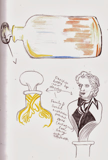
Here are series of drawings from my sketchbook, following the meeting with the production team earlier today. I started to include colour and conceptual imagery to the idea...
I wouldn't say this was the best day of development, but it was interesting to see how how themes could be incorporated into the 'ship in the bottle' idea. I particularly like the idea of the bottle being shapes like a building in Bath or the cork being in the shape of a dandy/satirical upper class character. This would put the bottle idea into more context of other parts of the text as well as setting the scene of the play. I also like I've started to document colour into my drawings, therefore I can get a sense of how it could be used later on.
On a secondary note, I'd like to explore drawing textures more that could be applied to the poster, perhaps using programs such as Photoshop and Illustrator.
Meeting with Costume students and the Director of the Theatre Production
This was a chance to present my ideas for the poster to the Director and also to view the theatre space at The Dance Pavillion in Bournemouth town centre.
During the meeting, the director looked at my three initial ideas for the poster and seemed very enthusiastic about incorporating naval imagery into the poster. Therefore she was drawn to my 'ship in a bottle' idea as she liked the representation of Anne, the protagonist, bottling up her feelings about her engagement to naval captain, Captain Wentworth. She was eager for me to explore naval imagery more and showed me several images of naval imagery ties into 3D work and costume as inspiration.
The set designer, Rhyannan, talked about how she was looking into projecting illustrated images as a backdrop for the set and asked if I would be interested in incorporating this idea into my learning agreement. This was an idea that intrigued the director and she suggested we both looked into GOBO lighting, that allows a silhouette image to be projected across the stage. Its an idea i'm willing to look into especially if my final outcome could be viewed by a wider audience.
This meeting proved very helpful and starting to build more skills as an illustrator, being able to negotiate my ideas outside of the university environment. I have still have a lot of development to do and I'm eager to explore other techniques that may drive my practice more.
Subscribe to:
Comments (Atom)


