Wednesday, 4 December 2013

Lighting issues and creating the right ambience for the final pieces

In the photoshoot I have a number of issues with either too much light or too little. I needed to get the balance between the shadows being sharp enough (i.e. the background being dark enough) with the foreground being well lit. It was extremely difficult to do without making the images look amateur. 


 The lamp I was using was allowing too much light through, creating a large box shadow over my GOBO images. to solve this problem, I created a slotted shape gobo to go over the light. This was only the foreground of the box was lit. This was certainly a very amaeteur process. If this was the installation was my final piece, i would have invested more time making the light visually appearing rather than a lamp wrapped in black paper and masking tape.


Final proposed images

For my deadline submission I wanted to present three different set designs, as a end point to the project. Although they hare not in a sequence necessarily, it is important that they all reflected on the same narrative and can be identifiable as a set in my portfolio. My choice not to present sequential images derives from my focus primarily on creating images for a poster for most of the project. This project has ended up being more authorial than narrative based than anticipated.


Throughout the photo shoot, it was extremely important for me to illustrate the performativity of the images within the installation. I wanted the viewer to feel as if they were in the room with me rather looking at a flat image. I am making the point that despite my 3D images being presented at 2D images they still have the ability to consume the viewer and disillusion them away from reality.

I took a variation of portrait and landscape images. This is, as I believe both to have different theatrical qualities.  The landscape images reflect on the structure of the theatre amphitheater. Something I did not illustrate in the structure of my shadow box, which was advised to be landscape. I have had mixed reviews about the composition of the landscape images. Some really don’t like the amount of black surrounding the model box, whereas some others appreciate the negative space. Originally, I was only going to submit the landscapes versions each with a close up version (not of the same composition). However, it was pointed out by a peer that the landscapes could be cropped to portrait focusing the viewer attention on the model box. I really don’t like these versions, most probably because they were photographed landscape and I did not intend for those compositions to be portrait.


After getting the print outs of my final images it was evident that the backgrounds were out of focus compared to the sharpness of the foreground. If I had had the time, I would have given myself more time, to get print outs and make changes if necessary. For the final major, my final images will also act as promotional material at the degree show. I would like to these images more tactile, possible getting handcuts lasercut to give to possible clients/agencies. In general I am pleased with these images. A few weeks ago I was really unsure of what my final outcome would look like. To be honest, I was in such a panic, I wasn't even sure if I'd have any final images to show. I need to keep in my mind, that I have the ability to create finalised images even after having a lot of self-doubt throughout this project. I'd like to think in the final major i'd have more faith in myself.

Final evaluation of project

This project has been a major learning curve for both my practice and myself as an individual.

I entered this unit with the intention of exploring illustration within the context of theatrical set design.This was mainly influenced by my previous projects which were were both interpretations of theatrical performances. During the summer, I had got involved with the first Reading Fringe festival, meeting with directors, actors and theatre enthusiasts alike. This was a great opportunity to network with other creative people and feed my enthusiasm for theatre and the arts. I also had a great opportunity to design a poster for the first production of the season at AUB. I was really chuffed and felt like my direction towards becoming more set design based was realising. However, I feel like that my approach to the design of this poster may have put me on the wrong course for the PMP unit. Even though, I had directed my practice more towards paper cut and 3D illustration, I chose to create coloured pencils drawings. These of course do you not reflect my current practice. I felt like I had come round in a circle once again in my practice, feeling unprepared for third year. In effect, I allowed self-doubt  to overwhelm me.

Despite this difficult time, I did produce a lot of imagery, focusing on the naval references in the novel. I drew lots of abstract and expressive drawings which most definitely helped a lot later in the project when I was in need of extra inspiration. A lot of my initial drawing came from found imagery or those from books. I think that its important in the next project to collect a vast amount more of my own imagery sourced either through photographs I take myself or location drawings. These perhaps would give me more scope for development and make sure I don't rely so much on secondary research.

My initial drawings led me to experiment a lot with 3D paper modelling. A lot of the skills I applied to these experiments derived from the convergence/divergence unit, where I experimented a lot with paper masks and costume accessories. In contrast, this project took me further. I found myself making large objects out of cardboard and thick paper card. I started to think of the objects as installation pieces or pieces that could be added to a set. I do regret not taking some of my initial making experiments further. For example; an abstract paper head, in which i weaved paper through to create hair never as finished nor used. Many experimentations never got finished because of my lack of enthusiasm at seeing them finished. I also regret not taking them further with varied materials. Some experiments that didn't necessarily work in a particular material could have worked better in another: My only comment about this is that there was obviously a reason behind this and that is that i needed some middle ground between drawing and more tactile illustration. I didn't fully acknowledge this until past the mid-way point of the project. This was my recognition of my paper cut artwork as a technique worth investing time into. It was a evident way in which i could translate my often expressive mark marking style of drawing. Compared to the mechanics of paper modelling, I was given more scope to be fluid and more abstract with my creation of imagery. As I started to become confident in this technique, image making became much easier again, and I thought more clearly and constructively in my image planning. Furthermore, I constructed a way in which illustrations could become performative. This would involve layering simple paper cuts to create an overall sophisticated image, with the help of a box. These would be then be photographed as an installation. The atmosphere created within this photograph would overall be as performative as a theatre performance itself. I also love the  interactivity with my work from the paper cutting to the creating the installation, and find that physicality really exciting. I'd like to think that the photos suggest some of this.


In my final major project, I'd like to explore performance in other methods of installation work. I would also like to focus more on an original topic rather than a chosen text. At times I felt limited by the text to create imagery. I like the idea of creating work that relate to issues closer to home. I think it is important that i base the next project on more primary research than this project.

I am happy to say that I no longer aspire to be a theatre designer but an illustrator that explores the idea of performance in her work.


Tuesday, 3 December 2013

Alterations to model box 2

My decision to spray paint the model box black was a idea generated from my conversation with the David, the senior lecturer of photography's suggestion to use a black background as a background for my images. Also being a stagnant colour, meant that not much light light would be reflected off the surfaces making it easier to control the direction and colour of the light. I liked the idea of having a contrast between the background and the box as well. On top of this, i feel like it makes it look all that more presentable.


Another tip that David gave me was to photograph my images with north light (natural light). I went about doing just this. However, the stark contrast between the black of the box and the white background didn't quite sit right with north light. It seemed inevitable that i'd need to create an ambience with artificial lighting. In reflection on the photographs i'd already shot, I decided to unwrap the lights form around the table as I decided it was too distracting from the layered scenes. I was determined to direct the viewer's attention directly at the middle of the composition.


I decided also to play around with the positioning of the lighting within the model box. The above image shows how I lined the ridges with the LED fairy lights. This made sure that each scene would be equally lit: Here are some of the results from this experiment....


Saturday, 30 November 2013

Making miniature versions of GOBO lighting

Following on from my previous post, it became evident that by shining a LED torch underneath a stencil created a clear and poignant image behind the model. This could easily be hidden from the voyeur to disillusion them to where it is coming from. For the purpose of this experiment I used a torch app on my smartphone. Although effective, If i were to do something similar in my final major or separate future personal project, I would most definitely explore permanent lighting fixtures into the set. On the other hand, having a light which wasn't fixed meant I could control the distance between the light and the stencil, this could create a varied photo shoot of large, small, dark and faded shadows. What I have built is essentially a makeshift GOBO light. At the beginning of the project I actually discussed the possibility of designing GOBO stencils or projected images to be shown on the backdrop of the set. But due to the uncertainty of this being able to happen both myself and set designer decided not to go forward with the idea. It seems ironic that I have gone down this same path again.

For the shadow images, i tried to choose strong symbols that fitted with the scenes they cast over. Some worked such as the simple sail form, whereas others such as the anchor/chandelier didn't. I think the reason being, the shadows outside of the model box helps the audience differentiate between interior and exterior as the image of a window would. 


I also experimented with type as a stencil. This proved quite difficult to cut as the type needed to small to project the shadows well. This was to go along with the letter scene. I also made up a stencil with 'persuasion' within it. This is would help would help create a proposed image for a poster. 


The above two images present another stencil I tried out. It was an extension of the simple ship sail stencil I had already made. I felt like the ship needed some context seeing as the Bath scene had a city line shadow. I had the idea to incorporate the image of the cobb at Lyme Regis. An iconic image for the location as well as a key image for the novel itself (one of the character falls of the steps of the cobb).


My favourite out of the gobo stencils has to be the bath scene. Even though compared to the other stencils, its stencil isn't much of a masterpiece, I think it generally frames the model box really well. 

Making model box take 2


For the initial construction of my second attempt at model making, I went about gluing the ridged staggered along the height of the box. I wanted slots for four layers. This meant 16 of these 1.5cmx42cm length of wood. Two for each ridge. Aware of my lack of technical skills when it came to model making, I was vigilant with measuring up and ensuring the ridges matched up to avoid any mistakes. I also sought out the assistance of my housemate to hold the pieces of wood as I drilled and screwed the pieces of wood together. Despite, not drilling my fingers off and successfully constructing the box, I would much rather make any future 3D structures in the workshop, where I have access to an appropriate environment for drilling.


I did have some trouble with splitting in the MDF whether the nails were too big for the 12mm width. This is a important issue I need to consider in the future experiments.
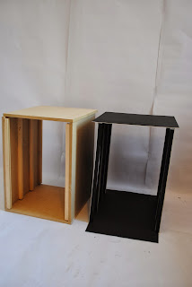
 There is an obvious comparison between my two model boxes. I am very glad that I pursued the construction of a wooden box. Even though, it is still unfinished, i.e. I need to spray paint it black. It looks much sturdier. I do however have the fact it was suggested to create a landscape box as an issue. After putting the box together, it became apparent that the scenes I had previously cut by hand were too big for the slots, even with some of the scenes having space to be cropped, other layers such as the ornate seaweed border, were too delicate to be cropped any more. Therefore they had to scrapped form the final images. This is very annoying as the main reason that I decided to keep the set box portrait was so that i didn't need to re cut already made image. Anyhow, I can only take this as a lesson to be more considerate of measurements.

On a separate note, I am unhappy with the box being on the floor, it limits the viewing experience for the audience/viewer as well as limiting angles in which light can be shone onto the model and scenery. I have though up a solution to use a coffee table as a plinth to raise the model of the floor. I had also bought a king size white sheet as a solution to my issues with dodgy studio backgrounds. Instead, i am going to use it to cover the coffee table.


For the initial photo shoot, i secured the lights to the lid of the model box in a looped shape. This essentially allowed me to control the lighting. It also worked as if the model box was a room, being lit form lighting from the ceiling. It was also neat and wasn't too obvious to the viewer how it was being lit.  The rest of the lights, wrapped around the table to create a barrel like image in the composition. 

On the other hand, the lighting positioning seemed to work better with some scenes and not so much on others. I think perhaps the fact the model box is still unpainted is an added issue to photographing the scenes. Similarly to the first model box, the light colour of the wood means differing coloured shadows are projected onto the surrounding walls. This is increasingly become a distraction from the paper cuts. Also I don't like that the audience are able to see what the box is made from. In a theatrical environment, an audience will not be able to see the structure of the theatre (unless it is intentional). This supports the theory that traditional theatre creates an illusion of reality. My approach to this text is not dadaist. I am complacent to make my audience concentrate on the imagery i have made rather than ponder on why I've created it. 

Unfortunately, my initial plans to create shadows through negative space images did not work as planned. Although, the delicate design of the bottles worked quite well by themselves ( see last three images). Similar to my experimentation with shadow making on my A1 3D anchor/chandelier, I was able to create a double shadow behind the model box. I find that the shadows created behind when shooting the image can be just as effective as the layered images themselves. I intend on exploring more how I can manipulate the shadows to create separate images. Perhaps if I hand cut stencils and shone a light through them as i did with the window I may be able to create more of an installation experience for the viewer.